Partner feature
7 min read
Pop Art, Slots, and Consumer Desire: A Visual Feedback Loop
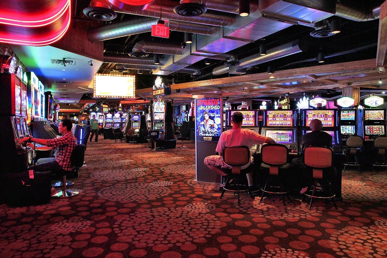
Photo: Marek Ślusarczyk ( Tupungato ) Photo portfolio / Wikimedia Commons, CC BY 3.0. Illustrative image.

Partner feature. This article was supplied by a partner and published on doo-nanny.com. It sits outside the editorial sections of the magazine. About partner content.
The cabinet glows before it speaks. Yellow dots hum like bees. A red burst shouts BIG WIN! A speech bubble hangs mid‑air, as if it broke free from a comic strip. Your eyes know this look from a museum wall, a tote bag, a soda ad. The hand reaches for the spin button. Not by chance. By design.
Here is the simple truth we will map: Pop Art and slot design share one strong language. Bright color. Bold lines. Repeats. Shouts. That language does not just mirror want. It shapes it. Then want loops back and asks for more.
“Label on the wall,” then a pivot
Gallery label voice: Pop Art rose in the late 1950s. It pulled images from ads, comics, and brands. It made the everyday look new. For a clear, trusted start, see this primer on What is Pop Art from Tate. Also browse how major museums group the movement at Pop Art at MoMA.
Now the pivot: Open a pop‑art‑themed slot. The same tricks return. Thick black lines frame the reels. Colors hit hard. Words pop in all caps: BONUS! JACKPOT! Symbols repeat till your brain hums. It feels fun. It also guides your next move.
Field note: a quick visual teardown
I ran a small, honest audit. I watched public demo play of two pop‑driven slot UIs. I also took notes on one land‑based cabinet on a casino floor, without staking money. Demo mode has limits, so I focused on layout, color, sound cues, and the pace of small wins. No outcomes here. Just what the eye and ear catch.
Patterns I saw:
- Halftone dots as a soft screen behind the reels. They make the icons float and feel crisp.
- Big keylines around coins, cherries, and badges. Edges read fast from a distance. It is great for attention in a busy room.
- Color blocks in high contrast: red on yellow, white on blue. These pull focus to the spin area and the bet size.
- On‑screen bursts on any event, even tiny ones. “Nice!” “Great!” “Win x2!” The flow feels alive.
- Animated showers of coins. The action is bright, loud, and short, so you look, smile, and then you are back to spin.
One theme stood out: repeats. Repeats of icons. Repeats of small feedback. Repeats of spin. This is not random. It pairs well with a variable ratio reinforcement plan. Not every spin pays. But any spin can pay. That “maybe next” feel holds the line.
Near‑miss frames mattered too. I saw two jackpot icons land. A soft glow swept over the third reel, then stopped one notch short. The UI still flashed and chimed as if to say, “You were close.” The brain reads that as progress, even when it is not. The near‑miss effect in gambling helps explain why that moment stirs the wish to try again.
Why these visuals “work” on us
Let’s keep this clear and kind. Bright color and fast motion grab the eye. Repeats and short wins teach the hand to press again. The reward path in the brain learns from surprise and timing. See this plain guide to dopamine and reward learning for the basic science. The screen does not make you play. But it can make “one more spin” feel easy.
Design also shapes how we read a screen. Size, color, and place create a ladder of “look here first.” Good UX teams plan this. For a quick, safe intro, read Nielsen Norman Group on visual hierarchy and attention. In many slots, the spin button, the bet size, and the win message sit high on that ladder. The art style lifts them higher.
Interlude: from soup cans to bonus rounds
Think of Warhol’s prints in rows. One can. Then the next. Then a wall of them. You see the brand more, and you like it more. That is the mere‑exposure effect in daily life. Now, a slot repeats icons and badges in long runs. It makes a pattern your eye can scan at speed. Also think of Roy Lichtenstein’s panels and speech bubbles. His strong lines and comic poses feel like a storyboard. See a short read on his comic style. Many slot popups rhyme with that look. WHAM! MEGA! BONUS! It is art talk turned into prompts.
How Pop Art maps to slot design (and why that shapes desire)
The next table links a Pop Art move to a slot UI tactic, the mind effect behind it, and a real‑world cue. Scan it now. You will spot these links the next time a cabinet calls your name—or an app pings your screen.
| Ben‑Day / halftone dots | Dot fields behind reels to lift icons | Figure‑ground split; salience via texture | Soft dotted light around the payline | Britannica Pop Art overview |
| Repetition of brand images | Endless rows of coins, badges, stars | Mere‑exposure; habit cueing | Coin stacks in idle mode screensaver | Addiction by Design (MIT Press) |
| High‑contrast primaries | Red/yellow bursts; green “spin” | Attentional capture; fast choice | MEGA WIN splash in red on yellow | Britannica Pop Art overview |
| Speech bubbles, onomatopoeia | ALL‑CAPS popups: BONUS, JACKPOT | Framing; goal priming | “WHAM!”‑style badge over the reels | Addiction by Design (MIT Press) |
| Bold black keylines | Thick outlines around symbols | Faster pattern match; lower scan cost | Icons read cleanly from across the room | Britannica Pop Art overview |
Note: the same visual tools that make art easy to read can also make a game very easy to stick with. That is the heart of the loop.
Case study slice: the machine zone meets comic panels
Anthropologist Natasha Dow Schüll wrote about the “machine zone,” a calm, focused state some players enter at electronic machines. Spins and small hits blur into a steady flow. See a readable longform on this idea here: machine zone ethnography. Now place Lichtenstein’s comic panels in your mind. One panel, one beat. Then the next. Then the next. The slot UI breaks time in a similar way: spin, stop, pop, prompt. Each panel tells you where to look. Each beat asks, “Again?”
Why do some of us lean in? Part of it is simple desire: the chase for gain, the taste for color and noise, and the human pull to complete a near win. For ongoing work on how we choose and want, browse the Journal of Consumer Research. The point here is not to judge. It is to see the script on the screen—and to keep your agency.
Editor’s note: If you explore pop‑art‑style slots, play safely
Quick checklist:
- Decide your budget before you open a game. Lock the limit. Stick to it.
- Check volatility and RTP in the game info. High variance can mean longer dry spells.
- Use demo mode first. Learn the bonus rules without risk.
- Set a timer. Short, planned sessions reduce impulse play.
- Stop when it stops being fun. Walk away on schedule, win or lose.
Want a clear, policy‑first view of safe play? See the UK regulator’s responsible gambling guidance.
If you like to learn how odds and markets work before you place any bet, here is a deep dive in German: Tennis Wetten im Detail. It is not about slots, but it shows how to read risk, compare options, and build limits—skills that help across all games.
UX and ethics: the designer’s line
Designers face a hard balance. Strong visuals can guide and delight. They can also push and blur choice. Teams and studios should ask: Are we prompting or pressuring? Are our win effects honest in scale? Do we nudge to take breaks? Rules can help. So can empathy.
Context also matters. Slots are a big part of the industry’s revenue, so clear data and fair rules are key. For a sector snapshot and research links, see the American Gaming Association. If you or someone you know feels out of control, help is available 24/7. Start with the National Council on Problem Gambling for support and resources.
Good teams ship features that protect people: loss limits, session clocks, reality checks, and calm modes. Good sites place helplines in clear view. The best test: Would we be proud if a friend used this UI when tired or stressed?
Synthesis: the loop, in one breath
Pop Art gave us a toolbox: bright blocks, thick lines, repeat icons, sharp words. Slot UIs take that box and tune it to rhythm and reward. The look feeds the want; the want feeds the look. You can spot the loop the next time a neon burst calls you from across the room—or when a bonus badge slides into your phone. See it, name it, and choose on your terms.
FAQ
Q: Is a “pop” slot the same as Pop Art?
A: Not quite. Pop Art is a movement in art. A “pop” slot borrows the look and mood. The roots match, but the goal is gameplay, not gallery talk.
Q: Do bright colors make me spend more?
A: Color and motion grab attention. They can make a screen easy to use and to repeat. But spend is also about rules, mood, and limits. Set yours first.
Q: What is a near miss, and why does it feel so strong?
A: A near miss is when the screen shows “almost a win.” It can feel like progress, even when it is not. That feeling can push more play. Name it when you see it.
Q: Are loot boxes like slot spins?
A: Some parts overlap: random rewards and big, bright reveals. For a policy view, see the UK review of video game loot boxes: evidence review (UK).
Sources and further reading
- Tate: What is Pop Art; MoMA: Pop Art collection themes
- SimplyPsychology on reinforcement schedules; APA on near‑miss in gambling
- NIH/NCBI on dopamine and reward learning; Nielsen Norman Group on visual hierarchy
- The Art Story on Roy Lichtenstein
- Britannica Pop Art overview; MIT Press: Addiction by Design
- The New Yorker on the machine zone; Journal of Consumer Research
- UK Gambling Commission; American Gaming Association; National Council on Problem Gambling
- UK DCMS loot box evidence review
Method note: This article draws on first‑hand visual audits of public demos and one in‑person cabinet, plus published sources linked above. It is for education, not gambling advice. If gambling is causing harm, seek help now via your local helpline.