Partner feature
8 min read
Neon Dreams: The Aesthetics of Las Vegas in Contemporary Art
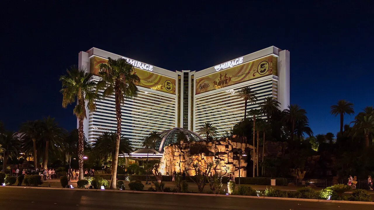
Photo: Dietmar Rabich / Wikimedia Commons, CC BY-SA 4.0. Illustrative image.

Partner feature. This article was supplied by a partner and published on doo-nanny.com. It sits outside the editorial sections of the magazine. About partner content.
Preface: a note on sources and seeing. This article draws on museum archives, conservation guides, artist notes, and public records. Citations appear inline. Technical terms stay as terms; language stays clear. The goal is simple: show how Las Vegas light shapes art today, without hype, and with care for facts.
Cold open — a night drive on the Strip
The air hums. Letters buzz. Color floods the windshield, then slips over chrome and glass. Light is not only bright here; it feels thick, like paint. Bulb rows chase in steady loops. Arrows wink. Script curls like smoke. It is theatre for the eye, built to pull you forward, turn by turn. This is not only a city. It is a studio where signs are the brushes, and the night is the wall.
What we talk about when we talk about neon
Neon is a gas that glows when a charge runs through a hand-bent glass tube. Argon and other gases add more tones. In the early 20th century, neon marked shops and streets around the world. In Las Vegas, it became the city’s face. The mix of desert dark and long roads made light a need and a sign of life. Over time, the sign grew into the show.
Many classic tubes are now replaced by LEDs. LEDs are small, cheap, and sip power. They can copy most colors. Still, glass neon has a warm edge and a line that feels alive. That is why artists keep both in play: old glow for mood, LED for control and scale.
For a clear base on neon’s science, see Britannica on neon lamps. For the city’s own archive of signs, see The Neon Museum in Las Vegas.
Field note I — the Boneyard quiet
By day, the desert sun bleaches paint. By dusk, the old tubes wake in soft bands of red, pink, and ice blue. In the Boneyard at The Neon Museum’s partner page at Google Arts & Culture, letters rest like bones. Bulbs that once yelled now mutter. You see hand-bent curves, scorch marks, weighty steel backs. You read the city’s memory in the rust. Each sign holds a small grammar: arrows to guide, script to charm, caps to shout. It is a textbook, but outdoors, and full of ghosts.
From kitsch to canon: how Vegas entered the gallery
For years, critics called Vegas “kitsch.” Yet artists saw a strong visual code with clear goals: catch the eye, hold the gaze, cue the next move. Pop Art took street and ad images and set them on canvas. That move opened the door. See Tate’s overview of Pop Art for the roots of this turn. Later, artists used “appropriation,” which means to lift a known look and twist its meaning. The method lets them test power, want, and fame. A short primer lives at MoMA Learning on Appropriation.
As museums warmed to design and mass taste, spectacle itself became a subject. Vegas, with all its shine, moved from punchline to case study. The city’s palette, fonts, and light tricks now sit in galleries and public art. The show goes on, but often with a wink, or a sharp note under the glow.
Materials and methods: glass, gas, and the LED turn
Neon tubes give a live, even line. They need skilled hands, a transformer, and care. LEDs offer tiny points of light that can map to almost any form. They run cool and last long. They can dim and chase at will. The result: more control of pace and mood, a key tool in big rooms and large facades.
For tech basics and energy facts, use the U.S. Department of Energy LED guide. For care of modern materials, see the Getty Conservation Institute. Many artists mix both worlds: glass for a warm line and lore, LED for scale and code-heavy patterns. The choice is not only about look; it is about meaning, labor, cost, and time.
Vegas visual grammar in contemporary art — a quick table
| Script neon cursive | Hand-bent glass; neon/argon | Classic motel signs; text works by artists like Olivia Steele | Warm talk tone inside ad space; soft power | Needs skilled glass work; transformer upkeep |
| Monochrome wash | LED light bath; Ganzfeld | James Turrell, Akhob (Las Vegas) | Slows time; invites stillness in a rush city | Driver life; access control; strict safety |
| Candy-color stacks | Painted stone; outdoor install | Ugo Rondinone, Seven Magic Mountains | Pop meets land; selfie-age totem | Sun fade; sand wear; repaint cycles |
| Marquee typography | Bulb arrays; chase circuits | Strip and Fremont cues in hotel art | Stage of “arrival”; group focus | Power load; pattern programming |
| Glitch neon | LED strips; control drift | Works that mimic broken tubes | Beauty in failure; time as stress | Spare parts; firmware versioning |
| Desert mirror | Polished steel; film | Lobby and plaza mirror pieces | Self meets city; funhouse truth | Scratch risk; wipe marks |
Studio visits, compressed — three mini-cases
a) Public art in the desert: Seven Magic Mountains
South of town, seven stacks of bright stone rise from the flat. The colors feel almost digital against sand and sky. The piece is by Ugo Rondinone. It links land art scale to pop charm. It is free and open, and it pulls art out of a white box and into the wind. Details live at the official site for Seven Magic Mountains.
b) Immersion and stillness: James Turrell’s Akhob
In a hidden room, you step into soft, even color. It shifts so slow that your breath sets the pace. This is Akhob, by James Turrell. It proves that light can be a calm act in a city of noise. For a clear guide, see Atlas Obscura on Akhob. Note: access is limited and by plan.
c) City collections: ARIA and CityCenter
Some of the strongest works hide in plain sight: hotel lobbies, sky bridges, plazas. The ARIA/CityCenter Art Program brings major names to daily life. It bends the idea of who gets to see “big” art. Map and artists appear on MGM Resorts’ art collection page.
Interlude — a typographer looks at the Strip
Vegas letters do not sit still. They lean, curl, stack, and point. Script sells “warm and human.” Caps sell “big and sure.” Bulbs make rhythm lines. Arrows set a path. Kerning shifts to fit bends in glass. The whole street reads like a lesson in how type can move crowds. For more on type culture and sign craft, browse AIGA Eye on Design.
The ethics of spectacle: camp, kitsch, and critique
Camp loves style, shine, and pose. Kitsch loves comfort and easy joy. Both can be tools. Artists use them to ask, “What do we want, and why?” Some works praise skill and care in sign craft. Some show excess as a trap. Many do both at once. A frame for camp appears in The Met’s Camp: Notes on Fashion. For a short read on kitsch as a real taste, see JSTOR Daily’s look at kitsch.
This ethics lens matters in a city built on attention. It lets art hold two truths: that light can delight and still press on hard themes like risk, want, and loss. The best works do not just mirror the Strip. They slow it, bend it, and make room to think.
Beyond neon — desert minimalism and land works
Leave the town and the noise drops out. The Mojave has its own kind of light: dry, slow, and wide. Land artists used this quiet to test scale and void. The feel is the flip side of Vegas glow, yet both shape the region’s art voice. A key work is Michael Heizer’s Double Negative, two cuts in a mesa near Overton. It is huge, bare, and precise. Learn more from the Dia Art Foundation page. The pair — Strip and desert — forms a kind of call and response: blast and hush.
How artists borrow from casinos: UX, flow, and light psychology
Casinos are labs of attention. Paths curve so you keep moving. Light points to what comes next. Warm tones invite. Cool tones warn. Pulses set tempo. Loops of reward and rest keep time. Much of this system now sits on screens. Artists study these tricks to build rooms that steer mood with light and sound.
When design jumps from floor to phone, you can track how it works by reading independent guides. One useful source is the Gone Online Game India casino guide, which notes how interface light, timing, and clear labels shape play. It is a sober look at UX patterns, and at how good design can support fair use and informed choice. Such notes help artists and curators see the playbook that once lived only in brick and neon.
Collector’s note — caring for light-based art
Light art ages. Glass tubes can crack; transformers hum; seals fail. LEDs shift color or dim over years. Good care starts with clear docs: parts list, wiring map, software versions, and display rules. Stable power and climate matter. Makers often include a maintenance plan. For a careful guide on time-based media, consult Tate’s conservation notes. These steps turn “a glow” into a long life.
Field note II — off-Strip, on-foot
Downtown, Fremont Street folds old bulbs into a new light canopy. Side streets host small walls, local shows, and student work. The scale drops, and you can stand close. At the Marjorie Barrick Museum of Art (UNLV), shows link global art to the city’s pulse. The lesson is plain: Vegas art breathes on and off the Strip.
Closing — what glows stays
Las Vegas built a language of light that the world knows at a glance. Today, artists quote it, test it, and grow it. Some keep glass and gas. Some code pixels. Many do both. The best works do not copy the city; they read it. They turn flash into form, and heat into thought. That glow, once made for sales, now lights the way to new art.
FAQ
Why do some artists still use glass neon?
Glass neon has a live line and a soft edge that LEDs still struggle to match. It also signals craft, time, and touch. Those cues matter in the work.
Is LED “less real” than neon?
No. It is a different tool. LED adds control, low heat, and scale. The “realness” sits in the intent and the build, not the diode or tube alone.
What is the Neon Boneyard?
It is an open-air archive of old Las Vegas signs run by The Neon Museum. It preserves the city’s light history and offers tours and research access.
How do museums care for light-based art?
They keep detailed docs, test parts, manage power and heat, and plan for swaps. Many follow time-based media care guides, like those from Tate and Getty.
Sources & method
- Institutional primers and essays: Britannica, Tate, MoMA Learning, The Met, JSTOR Daily.
- Site and collection info: The Neon Museum, Google Arts & Culture partner page, MGM Resorts art collection, Seven Magic Mountains, Atlas Obscura on Akhob, UNLV Barrick Museum.
- Technical and care guides: U.S. DOE LED basics, Getty Conservation Institute, Tate conservation, Dia Art Foundation on Double Negative, AIGA Eye on Design.
About the author and editorial
Author: Editorial Team, Contemporary Visuals Desk.
Expertise note: This piece was prepared with review of museum materials and technical guides cited above. We avoid paid placements in sources. The link to the independent UX guide is for research context.
Fact-check and updates: We check all claims against the linked institutional pages. If you see an error, write to [email protected]. First published: 2026-06-07. Last updated: 2026-06-07.