Partner feature
9 min read
The Mathematics of Beauty and Chance: Probability in Art and Design
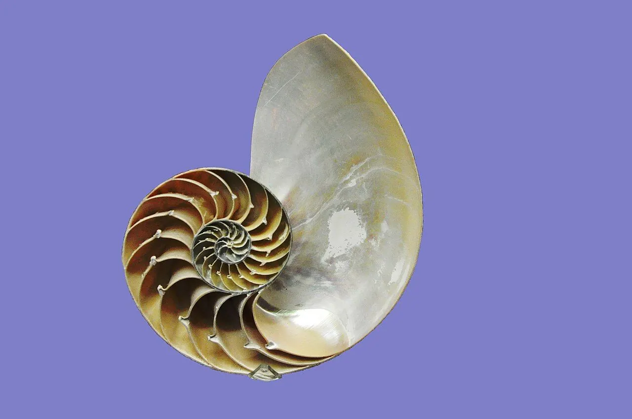
Photo: Philippe Alès / Wikimedia Commons, CC BY-SA 4.0. Illustrative image.

Partner feature. This article was supplied by a partner and published on doo-nanny.com. It sits outside the editorial sections of the magazine. About partner content.
We like pictures that feel clear but also a bit surprising. Math helps us do both. In art and design, we can use ideas like symmetry, ratios, and chance to shape what people see and feel. This guide shows how simple math ideas make images look calm, lively, fair, and real.
TL;DR
- Order (symmetry, proportion) makes things easy to read; chance adds life.
- Random is not one thing. The distribution you pick changes the look a lot.
- Tools like Perlin noise, Poisson-disc sampling, and Monte Carlo make natural scenes.
- Use seeds and rules to keep control of generative work.
- Be fair when chance affects users. Show odds, use certified RNGs, and add safeguards.
Contents
- Why math belongs in aesthetics
- The aesthetics of order: symmetry, proportion, fractals
- The aesthetics of chance: probability as a design material
- Probability under the hood: how computers render beauty
- Designing with probability: a mini-framework
- Case studies
- Ethics and fairness when design meets chance
- Common mistakes and myths
- Glossary
- FAQs
- Sources and further reading
- About the author and method
Why math belongs in aesthetics
Beauty is not magic. It is how our eyes and brain react to patterns in the world. We like balance because it is easy to process. We like a bit of surprise because it keeps us interested. This is why order and chance work so well together.
Some people say the golden ratio is a secret key to beauty. It is a cool ratio and shows up in nature. But it is not a law. Many studies find people do not always prefer it over other neat ratios. Use it if it fits, but do not force it. See a design view from the Nielsen Norman Group and a clear myth check by the BBC.
In this guide, we use simple math words. For harder terms, see the Glossary at the end. We also link to trusted sources so you can go deeper.
The aesthetics of order: symmetry, proportion, and fractals
Symmetry
Symmetry means a thing matches itself after a flip, a turn, or a shift. It helps us read shape fast. Faces, leaves, and buildings use it a lot. Our brains like it. See a short intro from Encyclopaedia Britannica and a deeper look at why symmetry feels good from the Royal Society.
Proportion
Proportion is the size relation between parts. Ratios like 1:2 or 2:3 can feel tidy. The golden ratio is one option among many. Good layouts often mix clear ratios with small shifts so the page does not look stiff.
Fractals
Fractals have patterns that repeat at different scales. Coastlines, ferns, and clouds show this. Fractal “dimension” tells us how dense a pattern is. Art that hits a “natural” fractal range can feel calm but rich. Learn what fractals are at Britannica. Also see debate on Jackson Pollock’s paint patterns in Nature.
The aesthetics of chance: probability as a design material
“Random” is not always mess. Different random rules make very different looks. This is the key idea.
Distributions shape the vibe
- Uniform: every spot is equally likely. Sounds fair, but points tend to clump.
- Normal (bell curve): most values sit near the middle. Good for soft variation in size or color.
- Poisson: great for events that happen with a steady average rate. In 2D, Poisson-disc sampling spreads points with a minimum distance, so they look even but not grid-like.
For a fast way to place points with “no neighbors too close,” see the classic note by Robert Bridson (SIGGRAPH): Fast Poisson-Disc Sampling.
Noise families
White noise jumps a lot. It looks harsh. Perlin noise is smooth noise. It varies gently, so it is great for clouds, wood, marble, and soft motion. For a friendly guide, see Scratchapixel.
Markov chains for controlled surprise
A Markov chain picks the next state based on the current state. You can use it to choose the next color, letter, or pose in an animation. It keeps variety but also a style. A short intro sits in MIT OpenCourseWare.
Probability under the hood: how computers render beauty
Monte Carlo and path tracing
Light bounces many times. It is hard to compute. Monte Carlo methods sample many random light paths and average them. More samples give less grain and more truth. The core idea is in Kajiya’s Rendering Equation and the open book Physically Based Rendering.
Dithering and halftoning
When you cannot show smooth shades, you can fake it with patterns of dots. This is controlled randomness. It is how old prints and screens show gradients. A gentle primer on halftones is in Stanford EE notes.
Designing with probability: a practical mini-framework
Here is a simple way to use chance with taste and control.
- State your bounds. What canvas size, colors, fonts, and shapes are allowed?
- Pick a seed. A seed lets you re-create the same piece later.
- Choose distributions for each property: Positions: Poisson-disc for even spacing. Uniform for chaos. Grid with jitter for a “hand-made” feel. Scale: normal (bell curve) so most items are medium with a few small and a few large. Rotation: small uniform range (e.g., −10° to +10°) for a subtle tilt. Color: start with a base hue, then add Perlin noise to vary lightness and saturation.
- Positions: Poisson-disc for even spacing. Uniform for chaos. Grid with jitter for a “hand-made” feel.
- Scale: normal (bell curve) so most items are medium with a few small and a few large.
- Rotation: small uniform range (e.g., −10° to +10°) for a subtle tilt.
- Color: start with a base hue, then add Perlin noise to vary lightness and saturation.
- Set rules. For example: no overlap, minimum contrast ratio, max of N elements per area.
- Test and tune. Change the seed. Adjust one parameter at a time. Save the best runs.
- Positions: Poisson-disc for even spacing. Uniform for chaos. Grid with jitter for a “hand-made” feel.
- Scale: normal (bell curve) so most items are medium with a few small and a few large.
- Rotation: small uniform range (e.g., −10° to +10°) for a subtle tilt.
- Color: start with a base hue, then add Perlin noise to vary lightness and saturation.
Mini-project: a poster with natural spacing and soft color drift
- Canvas: 1080×1350 px, dark gray background.
- Place 120 circles using Poisson-disc with min distance 28 px.
- Circle size: draw from a normal distribution (mean 14 px, sd 5 px), clamp to [6, 28] px.
- Base color: blue. Add Perlin noise to lightness and saturation for gentle shifts per circle.
- Typography: title centered; body text in a clean sans; align to a 12-column grid.
- Check contrast per WCAG; adjust any circle under 4.5:1 contrast with text behind it.
- Export three seeds. Pick the one with best balance and flow.
See WCAG rules at the W3C.
Case studies
Vera Molnar: rules plus chance
Molnar wrote simple rules, then let chance move a line here and there. The result feels alive but still clear. See her work at Centre Pompidou and MoMA.
Sol LeWitt: instructions as art
LeWitt made sets of steps. Others drew the lines. The process is the art. Chance can enter in how people follow the rules. Read about his wall drawings at MoMA.
Modern rendering
Film VFX and games use Monte Carlo path tracing to mimic real light. Noise fades as samples go up. This is why metals and glass look right today. The PBRT book shows it in depth: pbrt.org.
Data viz: use jitter
When points overlap, add small random shifts (“jitter”). It prevents over-plotting and reveals the shape of data. See a clear demo by Claus Wilke: Overlapping points and jitter.
Ethics and fairness when design meets chance
Chance can shape trust, not just style. If your app has random rewards or outcomes, be clear and fair.
- Show odds. If users can “win,” publish the percentages in plain words and numbers.
- Use a certified RNG (random number generator). Look for labs like eCOGRA or GLI.
- Follow platform rules. For example, Apple asks apps with loot boxes to disclose odds: see the App Store Review Guidelines.
- Design for informed choice. Clear UI, no dark patterns, and visible limits help users stay in control.
If you review or compare online games that use chance, check how they state RTP (return to player), how their RNG is tested, and what tools they offer for safe play. For a plain look at odds, testing, and UX around chance, you can read a helpful games strategy guide. Always add a short note that says “know the risk, set limits, and follow local laws.” For general rules in the UK, see the Gambling Commission.
Common mistakes and myths
- Golden ratio worship: it is a neat tool, not a magic law. Use many ratios and test.
- Uniform for everything: uniform randomness often clumps. Try Poisson-disc for even spread.
- Too much noise: visual noise can harm readability. Check contrast and motion comfort.
- No seed control: without seeds, you cannot repeat good results.
- No constraints: chance without rules can look muddy. Add bounds and simple checks.
Glossary
- Distribution: a rule that says how likely each value is.
- Uniform: each value is equally likely in a range.
- Normal (bell curve): most values near the mean, few at the edges.
- Poisson-disc sampling: places points with a minimum gap so they spread out evenly.
- Noise (white/Perlin): white is harsh random; Perlin is smooth random for natural looks.
- Markov chain: picks the next state using only the current state and a table of chances.
- Monte Carlo: solves hard problems by random sampling and averaging.
- Fractal dimension: a number that shows how dense and detailed a fractal is.
- RNG: random number generator, the engine that makes random outcomes.
- RTP: return to player, the long-term average percent paid back.
FAQs
Is the golden ratio really the key to beauty?
No. It can work well, but many other ratios also look good. Good design cares more about clear structure, contrast, and flow. See the NN/g article.
Which random distribution should I use for spacing?
Try Poisson-disc when you want even spread without a grid. Use uniform if you want chaos. Use a grid with jitter when you want order with a human touch.
What is the difference between noise and randomness?
Randomness is the source. Noise is how we use it in space or time. White noise jumps each step. Perlin noise changes smoothly.
How do I make generative art feel designed, not chaotic?
Set constraints, pick seeds, choose good distributions, and add simple rules (no overlap, min contrast). Adjust one knob at a time and keep the best seeds.
How can I tell if a game’s randomness is fair?
Look for odds disclosure, an RNG tested by independent labs (eCOGRA, GLI), and clear limits and tools for safe play. If in doubt, do not engage.
Sources and further reading
- Symmetry overview: Britannica
- Why people like symmetry: Philosophical Transactions of the Royal Society B
- Golden ratio myth check: Nielsen Norman Group, BBC Future
- Fractals basic: Britannica; Pollock debate: Nature
- Perlin noise: original paper on ACM DL; tutorial: Scratchapixel
- Poisson-disc sampling: Bridson (SIGGRAPH)
- Rendering equation and PBRT: Kajiya, 1986; pbrt.org
- Halftoning primer: Stanford EE368 notes
- Gestalt in UX: Nielsen Norman Group
- Accessibility: W3C WCAG
- Fair randomness: eCOGRA, GLI, UK Gambling Commission
About the author and method
I work in generative design and data viz. I build visual systems that mix rules and chance. For this article, I made simple tests (dot fields, noise textures, and a path-traced sphere) and compared looks at different settings. I used seeds so I could re-run the same cases. I checked claims against the sources above and against common practice in VFX, games, and UX.
Responsible use note: If you build or review products with chance, disclose odds, use certified RNGs, and add clear tools for limits. If you choose to play, know the risks, set time and money limits, and follow your local laws.