Partner feature
7 min read
Pop Art and the Jackpot: Consumer Culture on the Casino Canvas
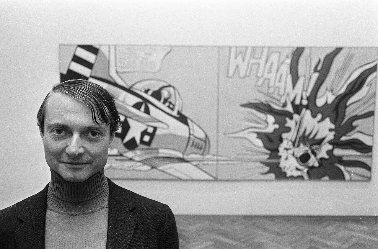
Photo: Eric Koch for Anefo / Wikimedia Commons, CC0. Illustrative image.

Partner feature. This article was supplied by a partner and published on doo-nanny.com. It sits outside the editorial sections of the magazine. About partner content.
You step into a casino at dusk. Cool air. A flash of chrome. Letters shout in red and yellow. Dollar signs wink like they know you. Fruit icons smile. The floor hums and clicks. A small cheer rises from a wheel. Your eyes jump from one bright square to the next. It feels like a comic panel come to life.
Here is the twist: this look is not random. It borrows from Pop Art, the art of soup cans, ben-day dots, and bright blocks of color. Pop Art took the things we buy and turned them into icons. Casinos took that same visual code and built a full stage. In this story, we will see how Pop’s language feeds the floor, why it works on our minds, and how to read the room with clear eyes.
- A short detour: what Pop Art really said
- Field notes from the floor
- From soup cans to slot cans
- Pop motifs vs casino triggers (quick table)
- Psychology, plainly
- Three quick case snapshots
- What Pop got right—and wrong
- Where our review hub helps
- Curator’s picks
- FAQ
- Endnote: the neon afterimage
Pop Art came first. What did it say?
Many think Pop Art is only bright fun. It is more. It shows and questions mass taste at the same time. A clear, short Pop Art overview notes how artists used ads and brands as their main tools. They made the everyday feel strange, then new again.
Tate puts it well: Pop is art pulled from media, comics, and stores. See Tate’s definition of Pop. Flat color. Strong lines. Clear icons you can spot from far away. It talks in the voice of the city and the screen.
Want a short route through the main names and the look? This clear movement guide shows how Warhol, Lichtenstein, and Oldenburg turned soup, dots, and soft sculptures into signs of our time. The key point for us: Pop cut the world into bold parts so the eye could read fast.
Notes from the floor
Stand near a row of slots. Count how often you see the same icons. Cherries. Bars. Sevens. Note the big type. The quick words. Spin. Max Bet. Bonus. Colors are candy-bright, like a pack of gum. The room sells a feeling, not just a game: easy joy, quick rules, clear wins.
Pop loved clean lines and repeat images. So do casinos. The room has a rhythm, like panels in a strip. You scan, not read. You spot a burst, a bubble, a star. That is no accident. Roy Lichtenstein made this kind of snap vision famous. See his work via the Guggenheim on Roy Lichtenstein. The same grammar shows up in modern slot UIs.
The hinge: from soup cans to slot cans
Warhol took a dollar sign and made it an icon. Casinos do the same. Dollar signs glow over walkways. Coins fly on screens. The bold, near-flat look makes the symbol feel clean and big. For a sense of the source, browse The Andy Warhol Museum and note how a simple mark can fill a wall. Casinos scale that trick to a full hall.
Pop also repeats. One can. One more. A full grid. Slots do that too. Lines of near-twins make your brain think, “I know this.” Big, high-contrast buttons tell you what to do. The effect is speed. Less thought. More action. Next, let’s map these echoes in one quick table you can scan in a minute.
Quick table: Pop motifs vs casino triggers
Here is a simple guide. It links a Pop motif to its casino twin and the likely effect on you. It is not a promise of wins. It is a map of how the room talks to your eyes and ears.
Why it feels alive: psychology, in plain words
Games pay on a “variable ratio” schedule. In simple terms, wins come after an unknown number of plays. You cannot guess the next one. This keeps the brain alert. It is a known idea in behavioral science. See the APA’s note on variable-ratio rewards. The short effect: “Maybe now” is a strong pull.
Color and sound help. High-contrast buttons reduce doubt. Bright tones mark events. Wins have crisp chimes. Losses are quiet. The body learns the code fast. For broad numbers on the scale and growth of gaming in the U.S., check the American Gaming Association research. When more people play, design gets even more tuned to fast reads.
Space matters, too. Paths curve so you pass many choices. Carpets steer your eyes. Light draws you to new zones. If you enjoy the history and plans behind such rooms, the UNLV Center for Gaming Research is a deep store of facts, rules, and data. It helps put the room in context.
A quick note: liking bright art and sound is normal. But bright cues can hide slow costs. Time fades. Bets add up. It helps to name the tools in use. When you can see the script, you can choose your next step with more care.
Three quick case snapshots
Neon as public Pop. Old Vegas signs are like Pop Art in the open air. The tall letters. The playful shapes. The bold glow. If you pass through Las Vegas, stop at The Neon Museum. You will see how the ad look of one age set the tone for games, shows, and streets. It is a walk through a light archive.
Art inside the house. Many big casinos hang fine art or design pieces by main paths. This can reset your mood and slow your pace for a bit. On the flip side, the gaming floor runs at a huge scale, hour by hour. To grasp that scale in one place, browse the UK Gambling Commission statistics. Large systems shape the feel of a visit as much as a single sign does.
Marketing meets meaning. Pop Art asked, “Are we choosing, or are we led?” That is still the question. Modern brands test color, copy, and layout. Good overviews on buyer choices live at Harvard Business Review on consumer behavior. Casinos use many of the same tools, with a faster loop.
So what did Pop get right? It saw that goods, icons, and stars are our shared myths. It got one thing wrong, maybe: how fast the world would learn to use that look back on us. Now we carry it in our hands. On screens. In rooms built for play. Knowing the code lets us enjoy the show and still keep the keys in our own hands.
Need clear, calm reviews? Start here
If bright signs make you curious but also wary, take a step back. Read before you spin. We keep a simple, test-based review hub that checks license data, RTP ranges, bonus terms, and real user notes. You can start with our independent guide here: best gambling apps real money. We explain how things work, not just where to click. For help and safer play tips in the UK, visit BeGambleAware.
Small disclosure: we may earn a fee if you visit a partner from our pages. Our tests and scores stay the same. We label ads. We do not promise wins. We want you to see the floor like a pro and choose with care.
Curator’s picks: see more, read better
Want to go deeper? Try these:
- A culture deep-dive with clear photos and stories at Smithsonian Magazine.
- A local museum tour when you travel. Note how sign styles change by city.
- Scan old ads and comics at your library. Watch how color blocks lead your eye.
- Compare a modern slot UI to a Pop painting. What repeats? What is loud? What is quiet?
FAQ
What is Pop Art, in simple words?
Pop Art is a 20th-century art style that uses things from daily life—ads, brands, comics—and turns them into bold, flat images. It shows our consumer world back to us. It can be both a praise and a question at once.
How does Pop Art link to casinos?
Casinos use Pop’s look. Bright, flat color. Clear icons. Big type. Simple words. Fast, fun signs. This makes the floor easy to read and quick to act on. It feels like a comic page, with each light a panel.
What design tricks keep people at play?
Unknown win timing (“variable” rewards), bright contrast, upbeat sounds for wins, and lots of repeat symbols. These cues are common in games and ads, too. Keep a limit. If you need help in the U.S., the National Council on Problem Gambling has free tools and hotlines.
Endnote: the neon afterimage
You step back out into the night. The glow stays on your eyelids for a breath. Once you know the Pop code—big color, bold icon, simple word—you will see it in every hall and screen. That is not a bug. It is a lens. Use it to enjoy the art of the room, and to guard your time and cash with care.
About the author
By a cultural design writer who has logged many hours studying museum shows, city signs, and casino floors. Works focus on how visual systems guide choices in real life.
Editorial standards
- We cite museums, regulators, and research bodies.
- We fact-check dates, names, and stats before we hit publish.
- We update when rules or figures change.
- We include clear links to safer play help.
Last updated:
18+ only. Check local law before you play. Gambling involves risk. You can lose money. Set limits. Take breaks. If you or someone you know has a gambling problem, seek help (UK: BeGambleAware; US: NCPG).