Partner feature
10 min read
Color, Light, and the Aesthetics of the Gaming Floor
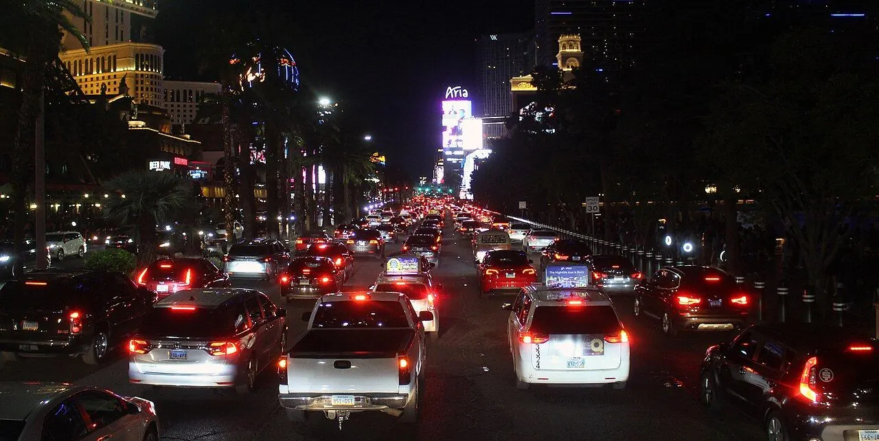
Photo: Coolcaesar / Wikimedia Commons, CC BY-SA 4.0. Illustrative image.

Partner feature. This article was supplied by a partner and published on doo-nanny.com. It sits outside the editorial sections of the magazine. About partner content.
Good design is not only “flashy.” On a gaming floor, color and light guide your eyes, help you relax, and shape how long you stay. This clear guide shows how color and light work together, what to watch for, and how to build a fair, safe, and easy place to play.
- Why Color and Light Matter More Than You Think
- The Psychology of Color on the Gaming Floor Warm vs. Cool Palettes and Perceived Value Saturation, Contrast, and Visual Fatigue Cultural Meanings of Color
- Warm vs. Cool Palettes and Perceived Value
- Saturation, Contrast, and Visual Fatigue
- Cultural Meanings of Color
- Lighting Fundamentals That Shape Experience Color Temperature (CCT) and Consistency CRI and TM-30: True Color of Chips, Cards, and Skin Layering: Ambient, Task, Accent, Decorative
- Color Temperature (CCT) and Consistency
- CRI and TM-30: True Color of Chips, Cards, and Skin
- Layering: Ambient, Task, Accent, Decorative
- Layout, Wayfinding, and Visual Hierarchy
- Materials, Finishes, and Reflectance
- Acoustic Comfort and Visual Calm
- Case Snapshots and What They Teach
- Player‑Centric Design and Responsible Environments
- How to Evaluate a Casino Floor as a Patron
- Future Trends in Casino Lighting and Color
- Frequently Asked Questions
- Key Takeaways
- Warm vs. Cool Palettes and Perceived Value
- Saturation, Contrast, and Visual Fatigue
- Cultural Meanings of Color
- Color Temperature (CCT) and Consistency
- CRI and TM-30: True Color of Chips, Cards, and Skin
- Layering: Ambient, Task, Accent, Decorative
Why Color and Light Matter More Than You Think
Color and light set the mood at first glance. They help you see signs, count chips, and find your seat. They can make a room feel warm, cool, busy, or calm. They also carry the brand feel of the house. A smart plan blends all this so the floor is clear and kind to your eyes.
Light can affect alertness and comfort. Bright light with the right color mix helps people feel awake and steady. You can read more on how light links to alertness in peer‑reviewed work from the National Institutes of Health (NIH): NIH open access articles. Color also changes how space feels and how we make choices. Research in the Journal of Environmental Psychology has studied color and mood in rooms: Journal of Environmental Psychology.
Good design is not a trick. It supports fair play, clear sight lines, and easy paths. It reduces glare. It lowers eye strain. It helps staff do their work well. The goal is simple: a place that looks great and feels good to use.
Takeaway: Color and light are tools for comfort, clarity, and brand, not just “flash.”
The Psychology of Color on the Gaming Floor
Color shapes how we feel. Warm colors can feel cozy. Cool colors can feel clean. Strong color can excite you, but too much can tire your eyes. Culture also changes how people read color. Test colors with your guests, not just with mood boards.
Warm vs. Cool Palettes and Perceived Value
Warm hues (like soft amber, gold, rust) can feel rich and social. They work well in lounge zones and slot areas. Cool hues (like soft gray, blue, teal) can feel calm and clear. They suit table games where focus is key. A blended scheme can cue zones. Warm accents pull you in. Cool task zones help you see cards and chips.
For a deeper read on color basics in light, see the Illuminating Engineering Society (IES): IES education resources.
Takeaway: Use warm for welcome, cool for focus, and blend them by zone.
Saturation, Contrast, and Visual Fatigue
Saturation is how strong a color is. High saturation grabs attention but can tire eyes if used across big areas. Save bold colors for signs, art, and small features. Keep large surfaces more calm so eyes can rest. Use contrast to mark key spots like cage, restrooms, exits, and help desks. But avoid harsh jumps in contrast that cause glare or strain.
Learn more on visual comfort and glare in Lighting Research & Technology: Lighting Research & Technology journal.
Takeaway: High‑chroma colors are accents, not walls. Contrast should guide, not blind.
Cultural Meanings of Color
Color meanings change by culture. Red can mean joy in one place and danger in another. Green can mean luck or calm, but also “go” for wayfinding. Always test palettes with local guests and staff. Do short pilots. Ask for fast feedback.
Takeaway: Do not assume one color means the same to all people. Test first.
Lighting Fundamentals That Shape Experience
Light has many parts. Three key ideas will help you most: CCT, color rendering (CRI and TM‑30), and layers of light. You do not need to be an engineer. Simple checks can raise quality fast.
Color Temperature (CCT) and Consistency
CCT tells you if light looks warm or cool. We measure it in kelvin (K). Lower K (like 2700–3000K) looks warm. Higher K (like 3500–4000K) looks cooler. Warm light can make a space feel cozy. Cool light can help with task clarity. Use one CCT per zone to avoid a patchy look.
More on CCT from the U.S. Department of Energy: DOE LED lighting basics.
Takeaway: Pick a CCT per zone and stay consistent inside that zone.
CRI and TM-30: True Color of Chips, Cards, and Skin
CRI is a simple score (0–100) for how true colors look under a light. Higher is better. TM‑30 is a newer, richer way to judge color. It looks at both accuracy and how vivid colors appear. With chips, cards, and faces, poor color can cause mistakes and discomfort. Aim for high quality color, not just high output.
Learn more from IES on color rendering and TM‑30: Illuminating Engineering Society and a practical explainer from the WELL Building Standard: WELL Light concept (overview).
Takeaway: Choose light with strong color quality so chips and cards look true.
Layering: Ambient, Task, Accent, Decorative
- Ambient: base light that sets the overall level. It should be even and calm.
- Task: brighter light for work, like tables, cashier, and security points.
- Accent: draws the eye to signs, art, entries, or new games.
- Decorative: adds style and brand feel. It should not cause glare.
Use dimming and scenes to shift mood by time of day. Avoid flicker. Flicker can cause strain or headaches. Quality drivers and good controls help. See DOE best practices for solid‑state lighting: DOE Solid‑State Lighting.
Takeaway: Layer light. Set scenes. Avoid flicker. Keep it even and easy on the eyes.
Layout, Wayfinding, and Visual Hierarchy
Light and color should help you move with ease. Paths should be clear without big signs in every spot. Use brighter, cooler task light at decision points. Use warm accents to invite. Keep the brightest point on what matters now: the next step, the next sign, or the service desk.
Good wayfinding uses landmarks, clear type, and simple color codes. If you mark a path in cool white light, use the same look along that path. Earn trust with steady cues. For best practices on signs and wayfinding, see SEGD (Society for Experiential Graphic Design): SEGD resources.
Follow accessibility basics. Keep text large with strong contrast. Learn more from W3C contrast rules: WCAG 2.1.
Takeaway: Use light as a map. Make decisions points brighter and cleaner.
Materials, Finishes, and Reflectance
Surfaces change how light acts. Shiny floors can cause glare. Gloss walls can bounce light into eyes. Matte or satin finishes often work better. Light reflectance value (LRV) tells you how much light a surface bounces. Light ceilings raise uniform light. Dark floors hide wear but can make the room feel heavy. Find a balance.
- Use matte on tables to avoid glare on cards and chips.
- Use soft sheens on metal trims to keep a premium look without hot spots.
- Pick fabrics that do not shimmer under LEDs.
For more on glare and comfort, see IES guidance and research journals: IES standards overview and Lighting Research & Technology.
Takeaway: Choose finishes that control glare and keep color true.
Acoustic Comfort and Visual Calm
Noise and light work together. Too much noise plus harsh light makes a space feel tense. Soft surfaces that absorb sound help your eyes relax too. Add “visual pause” zones with softer light, fewer patterns, and lower contrast. This gives guests a short reset so they can enjoy more time on the floor in comfort.
Learn general basics from the Acoustical Society of America: ASA resources.
Takeaway: Lower noise and softer visuals help reduce eye and brain load.
Case Snapshots and What They Teach
Snapshot 1: Slot Bay Refresh
The team swapped cool overhead panels for warm 3000K downlights on dimmers. They added soft, warm accents on columns. They cut glossy trim. Result: less glare on screens and more even light. Guests said the space felt “friendlier” and eyes did not tire as fast.
Snapshot 2: Table Games Clarity
The team raised task light at tables to a clean, neutral 3500–4000K with high color quality. They added matte table felts and a darker anti‑glare edge. Result: chips and suits looked clear, faces looked natural, and dealers made fewer sorting errors.
Snapshot 3: Wayfinding Boost
They set a “path of travel” with slightly brighter, cooler light and a simple floor line. Signs used one accent color. The cashier, restrooms, and exits had a clear glow but no harsh beams. Result: guests found key spots faster and asked staff for directions less.
For a design history angle, see Bill Friedman’s influential work on casino layout (context, not a one‑size‑fits‑all rule): UNLV Center for Gaming Research.
Takeaway: Small changes to CCT, glare, and cues can lift comfort in days, not months.
Player‑Centric Design and Responsible Environments
A good floor helps people make clear choices. Exits are easy to see. Help desks are bright and calm. Clocks are visible where allowed. Paths are clear and safe. This kind of design supports fair play and respect for guests. It also helps staff see and assist faster.
If you need help with gambling issues, please get support. In the U.S., visit the National Council on Problem Gambling: NCPG Help & Treatment. Please follow your local help lines if you live outside the U.S.
Takeaway: Responsible design is clear, honest, and easy to navigate.
How to Evaluate a Casino Floor as a Patron
Use this fast checklist when you visit or before you book:
- Even light: Are there no harsh bright spots or dark holes?
- Clear tasks: Are tables bright enough to read cards and chips with no glare?
- Wayfinding: Can you spot the cashier, restrooms, exits, and help desk fast?
- Color comfort: Do walls and floors feel calm, with bold colors only as accents?
- Noise: Can you hear staff without shouting? Do you have places to pause?
- Eyes feel okay: After 15 minutes, do your eyes feel relaxed, not tired?
If you like to compare venues before you go, online-casino-gambling-tips.com offers independent, criteria‑based notes. They look at lighting, wayfinding, comfort, game mix, and policy clarity. For adults 21+ only. Please gamble responsibly.
Takeaway: A quick eye test on light, cues, and noise tells you a lot in minutes.
Future Trends in Casino Lighting and Color
- Better LEDs and controls: Higher color quality, lower energy, smooth dimming, and low flicker. See DOE updates: DOE SSL program.
- TM‑30‑driven choices: More projects now test sources with TM‑30 to get accurate and pleasant color. See IES updates: IES.
- Scene design by zone: Morning, evening, event nights—each gets a scene to match mood and flow.
- Health‑aware light: Designs that cut glare, avoid flicker, and support comfort. Read more in WELL: WELL Light concept.
- Greener materials: Low‑gloss, durable finishes with better reflectance control and lower impact.
- Data‑driven layouts: Heatmaps and sensors to find stress points, glare spots, and crowd flow.
Takeaway: The future is human‑centered: true color, smooth control, and clear paths.
Frequently Asked Questions
What color temperature works best on a casino floor?
There is no single “best.” Warm (about 2700–3000K) can feel cozy in lounge and slots. Neutral to cool (about 3500–4000K) can help with table tasks. Pick one CCT per zone and keep it steady.
How do casinos avoid glare and visual fatigue?
Use matte finishes. Aim lights so you do not see the light source. Keep light levels even. Use diffusers and good beam spreads. Choose drivers and controls that avoid flicker. Follow IES guidance: IES standards overview.
Do color choices affect responsible play?
Color and light alone do not control behavior. But they can support clear signs, calm mood, and safe paths. This helps people make informed choices. Policy and support lines matter most.
Are LEDs always better for casino lighting?
LEDs can save energy and give great control. But quality matters. Pick good color quality (high CRI or strong TM‑30 scores), low flicker, and reliable drivers. See DOE advice: LED lighting basics.
How can I quickly judge a gaming floor’s design as a visitor?
Look for even light, clear signs, glare‑free tables, and easy paths. Check how your eyes feel after a few minutes. If you can find help fast and feel calm, design is likely good.
Key Takeaways
- Color and light build comfort, clarity, and brand—beyond “flash.”
- Use warm for welcome, neutral/cool for tasks, and keep CCT steady by zone.
- High color quality (CRI/TM‑30) keeps chips, cards, and faces true.
- Layer light: ambient, task, accent, decorative. Avoid glare and flicker.
- Wayfinding needs a clear visual hierarchy and good contrast.
- Finishes and acoustics matter. Matte and quiet often equal calm and clear.
Further Reading and Sources
- Illuminating Engineering Society (IES) education and standards: ies.org
- U.S. Department of Energy on LEDs and SSL: LED Lighting Basics and Solid‑State Lighting Program
- Journal of Environmental Psychology (color and mood research): sciencedirect.com
- Lighting Research & Technology journal: SAGE Journals
- WELL Building Standard, Light concept: wellcertified.com
- SEGD, wayfinding resources: segd.org
- W3C WCAG contrast guidance: w3.org
- UNLV Center for Gaming Research: gaming.unlv.edu
- National Council on Problem Gambling (help and treatment): ncpgambling.org
Editorial note: This article is for education only. It is not design, legal, or financial advice. If you choose to gamble, please do so responsibly. In many places you must be 21+.